Scale paper like grid
If you want to compare some time series of data with each other it could be a good idea to plot them just onto a grid without anything else. Here we will generate a scale paper like grid and plot two simple functions on it.
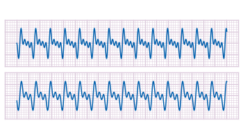
Fig. 1 Plotting some time data on scale paper like grid (code to produce this figure)
In Fig. 1, two harmonic tone complexes are shown, plotted within the
multiplot environment. But the thing to consider here is the grid below them. In order to get such a grid, we have to remove all borders and tics. This is done by the following code.
The second number of
scale for the tics corresponds to the minor tics and must be greater than zero, otherwise no minor tics will appear.
In the last step we enable minor tics on both axes, set the style for the grid and define the grid itself.
If we have more than one graph that should be displayed in a figure, the
Let us consider we have four different functions that should be presented in the same figure as shown in Fig. 1.
multiplot command is the one to use in Gnuplot. But as we will see this is not a trivial task.Let us consider we have four different functions that should be presented in the same figure as shown in Fig. 1.
Fig. 1 A multiplot with reduced axes labeling and nicely arranged graphs (code to produce this figure)
The functions are given by:
For an explanation of the used syntax to declare the functions have a look at the Defining piecewise functions article.
In a first attempt we just use the
multiplot command:
We also added a label to every graph in order to identify them easily in the figure. Note that we overwrite the label 1 for every graph. If we don’t do that, then on the last graph all four labels will be present. Using this simple approach we will get Fig. 2. As you can see this is not an ideal case to use the space in the figure. The xtics and the ytics are just the same in every graph and are not needed to be displayed on every graph.
Fig. 2 A straightforward use of the multiplot command to plot four different functions (code to produce this figure)
But before we fix this we will introduce the use of macros in order to shorten the code a lot. As you can see in the code block above, the set label command contains the same position for every graph. We can shorten this by:
and so on for the other graphs.
But the macros are not only useful for the different labels, but also for the other settings of the multiplot.
First we want to remove the x/y-tics and labels, where they are not necessary. Here it is the same as with the label settings. Every graph uses the settings from the graph before, if we didn’t change these settings. In order to remove the xtics at a given graph we have to tell this explicitly. Therefore we define macros for the two cases label+tics vs. nolabel+notics:
First we want to remove the x/y-tics and labels, where they are not necessary. Here it is the same as with the label settings. Every graph uses the settings from the graph before, if we didn’t change these settings. In order to remove the xtics at a given graph we have to tell this explicitly. Therefore we define macros for the two cases label+tics vs. nolabel+notics:
These will then be used in the plotting section:
Applying the axes settings will result in Fig. 3.
Fig. 3 A multiplot with reduced axes labeling (code to produce this figure)
Now the label etc. on the axes are done in a nice way, but the sizes and the spaces between the individual graphs are very bad. This comes from the fact that Gnuplot calculates the size of a graph depending on the presence of tics and labels. In order to have graphs with the same size and align them without spaces between them we have to set the margins of the individual graphs manually.
The trick is that we use the
These margins are then added in the same way to the multiplot command as the label settings and we get:
at screen command to arrange the margins absolutely in the figure. As you can see the bottom margin of the two figures in the top is placed at 0.55, the same value the top margin of the two lower graphs start.These margins are then added in the same way to the multiplot command as the label settings and we get:
Having done all this we will finally get our desired figure which is shown in Fig. 1.
No hay comentarios:
Publicar un comentario